Self-Service BI Mapping with Microsoft Research’s Layerscape–Part 2
Reposted from Chris Webb's blog with the author's permission.
In my last post I showed how to load data from Excel into Layerscape, the new data visualisation tool from Microsoft Research; in the post before that I showed how to load UK weather data from Windows Azure Datamarket into PowerPivot. Now let’s take that weather data and plot it on a map!
When doing this, the first decision I made with this data was about what to show. The main problem is that the data volumes involved here are very close to the upper limit of what Layerscape is able to handle: in a few cases I crashed Layerscape, but that was when I was trying to load around 150000 rows of data into it; I found that just over 110000 rows of data was ok however. As a result I made the decision to only show data for cloud or rain, not sun (which is ok – if you want to visualise a clear day, you don’t want to show anything on a map I think) or mist or fog (which I was less happy about).
To achieve this I created a calculated column on my Three Hourly Forecast table in PowerPivot called Cloud with the following definition:
=if([SignificantWeatherId]>=7, TRUE, BLANK())
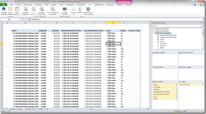
Then, after having created a flattened PivotTable with the data I wanted to display, I dropped the Cloud field into the Values box in my PivotTable and was able to filter it to only show Weather Stations and time periods where there was cloud:
I also created a few other calculated columns:
- ActualPredictionForStart and ActualPredictionForEnd: the former is mentioned in my previous post, and the latter returns a value three hours after the former:
=[Date] + (([TimeStep]+3)/24)
These two values represent the start time and the end time for each row in the Three Hourly Forecast table. - WeatherDepth: in the Significant Weather table there’s a distinction made between low-altitude cloud and high altitude cloud, and in LayerScape when you’re plotting data you can control how high off the ground a point is displayed, so the WeatherDepth column contains some fairly arbitrary numbers for cloud altitudes based on the [Code] column. Here’s the definition:
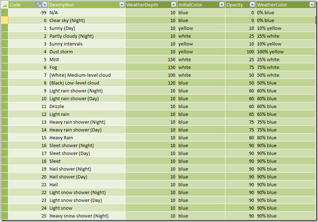
=SWITCH([Code], 5, 150, 6, 150, 7, 100, 8, 120, 10) - WeatherColor: again, in Layerscape you can control the colour of your points and their opacity, which again is useful for displaying dark/light and thin/thick clouds. The only compromise I had to make was to display dark clouds (ie where clouds are described as either black or where the weather is rainy or snowy) in blue rather than black, because I couldn’t get Layerscape to display black – white clouds are shown in white. To calculate WeatherColor I created two intermediate calculated columns on the Significant Weather table, InitialColor (which contains colours for weather that I’m not displaying in this demo – I thought dust storms should be shown in yellow for instance):
=SWITCH([Code], 1, "yellow", 2, "white", 3, "yellow", 4, "yellow", 5, "white", 6, "white", 7, "white", 8, "blue", "blue")
…and Opacity:
=SWITCH([Code], -99, 0, 0, 0, 1,10, 2, 25, 3, 10, 4, 100, 5, 25, 6, 75, 7, 50, 8, 50, 9, 60, 10, 60, 11, 60, 12, 65, 13, 75, 14, 75, 15, 80, 90)
…making the definition of WeatherColor:
=[Opacity] & "% " & [InitialColor] - Depth and Color: calculated columns on the Three Hourly Forecast table that copied the WeatherDepth and WeatherColor values down to the main fact table:
=RELATED(‘Significant Weather’[WeatherDepth])
=RELATED(‘Significant Weather’[WeatherColor])
This screenshot gives you some idea of the values that the depth and colour calculations return:
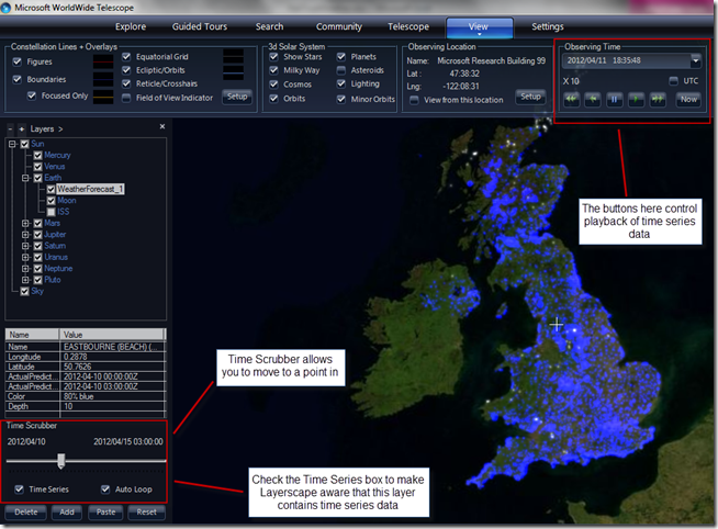
With this all done I was able to load the data into Layerscape in the way I showed in my previous post, tweak some of the settings for the markers and time decay, and come up with a nice-looking visualisation. The big difference in this case compared to my previous examples is that here we have time series data and Layerscape is able to show values changing over time. The only thing I needed to do to make this happen was to check the Time Series box in the Layers pane on the main screen; with this done I could show the data for a particular point in time or let Layerscape cycle through time showing how the forecast weather changed.
With that done, was able to save my demo as a very basic guided tour and upload it to the Layerscape site from where you can download it yourself :
http://www.layerscape.org/Content/Index/620
I also created a video showing the tour:
I’m quite happy to admit that this tour doesn’t show off the full capabilities of Layerscape (I’m not sure my graphics card is up to the job, frankly) and I’ve not taken much time to ensure that the visualisation is as accurate as it could be, but I’m still quite proud if it!
 |
Chris has been working with Microsoft BI tools since he started using beta 3 of OLAP Services back in the late 90s. Since then he has worked with Analysis Services in a number of roles (including three years spent with Microsoft Consulting Services) and he is now an independent consultant specialising in complex MDX, Analysis Services cube design and Analysis Services query performance problems. His company website can be found at http://www.crossjoin.co.uk and his blog can be found at http://cwebbbi.wordpress.com/ . |


